


What makes a blog page convert (and why it’s different from a landing page)
Blog page vs. landing page: different jobs, shared goal (conversion)
A landing page is built to close; a blog page is built to open. Both aim for conversion, but the routes are different.
Landing pages optimize for macro conversions (trial, demo, purchase) with a single, high‑intent CTA and minimal distraction.
Blog pages nurture micro conversions that compound into revenue: newsletter opt‑ins, content upgrades, “save/add to wishlist,” comment engagement, and internal link clicks to product or feature pages.
Why this matters: readers usually arrive on a blog page “colder” (informational intent via SEO), not yet ready to book a demo. A high‑performing blog layout meets them where they are, then shapes intent through:
Relevance: headline and intro that mirror the search query
Structured scannability: strong subheads, a sticky table of contents, short paragraphs, and visual cues
Progressive CTAs: soft prompts early (subscribe, download the checklist), stronger CTAs later (try the product, see a live example)
Trust builders: expert quotes, data, screenshots, and case snippets embedded near decision points
Smart internal links: contextual, above‑the‑fold and mid‑article pathways to features, templates, and comparison pages
In other words, a blog page converts by guiding, not forcing - moving visitors from “just researching” to “I’m ready.”
The conversion equation for a blog page
Conversion on a blog page is multiplicative - if one factor is zero, the result is zero.
Relevance (keyword/intent match) × Readability (UX) × Proof (trust) × CTAs (clarity) × Speed (performance)
Relevance: Match the target keyword and intent in title, H2s, and examples. Don’t bait‑and‑switch.
Readability: Clean blog page layout, generous white space, 14–18 px body font, 60–80 character line length, clear hierarchy, and accessible contrast.
Proof: Mini case studies, quantified outcomes, author byline/credentials, and up‑to‑date screenshots.
CTAs: One primary goal, staged secondary micro CTAs, and consistent copy that tells users exactly what they get.
Speed: Sub‑3‑second load, image compression, lazy loading, and minimal render‑blocking scripts.
"53% of mobile users abandon sites that take longer than 3 seconds to load." - Source
Speed multiplies everything else - if it’s slow, users bounce before your relevance, proof, and CTAs can work.
Key KPIs to track from day one
Benchmark early so you can optimize quickly.
CTR on primary CTA (per placement: top, mid, end, exit‑intent)
Scroll depth (25/50/75/100% to validate structure and CTA timing)
Read time vs. word count (true engagement, not just time on page)
Content upgrade opt‑ins (lead magnet conversion rate per article)
Assisted conversions (blog page’s role in multi‑touch journeys)
Internal link CTR (to product/features, templates, pricing, and related posts)
Pro tip: segment KPIs by device and traffic source - mobile SEO readers behave differently than desktop email subscribers.
Set the foundation with BlogBowl
Skip the heavy lifting and focus on content that moves the needle.
SEO‑optimized, fast templates: Lighthouse‑friendly blog page layouts tuned for Core Web Vitals.
Built‑in newsletter and content upgrades: Capture micro conversions natively - no duct‑taped plugins.
AI internal linking: Automatic, context‑aware links to features, templates, and high‑intent pages.
Embedded media on autopilot: AI adds unique images and relevant videos to improve dwell time and readability.
Result: less setup, more outcomes. Launch in minutes, publish daily, and turn every blog page into a conversion engine.
Above‑the‑fold essentials for a high‑converting blog page layout
Craft an SEO‑aligned H1 that mirrors query intent (include exact phrase where natural)
Your H1 should echo the searcher’s language and intent. If the target keyword is “blog page layout,” use it naturally in the headline and support it in the first 100–150 words. Align the promise of your H1 with what the intro delivers - no bait‑and‑switch.
Add a TL;DR (3–5 bullets) to win scanners and set a promise
A tight TL;DR gives readers the payoff upfront, reduces pogo‑sticking, and sets expectations for the rest of the page.
The exact problem this article solves, in one line
The specific outcome or framework readers will learn
Who it’s for and why it matters now
One quick win readers can apply in minutes
Show trust immediately: byline, updated date, estimated reading time, and category/cluster
Place author byline (with role/expertise), last updated date, read time, and category/cluster tags directly under the H1. This signals freshness, authority, and topical breadth - key trust cues for both humans and search engines.
"Users often read Web pages in an F-shaped pattern: two horizontal stripes followed by a vertical stripe." - Source
Design for scanning: front‑load key phrases in headings, keep paragraphs short, and position crucial info and CTAs along the top and left.
Primary CTA near the intro (soft offer): subscribe, content upgrade, or product tour
Avoid hard‑selling immediately. Offer a soft, high‑relevance action:
Subscribe for a companion email series
Download the checklist/template mentioned in the H1
Watch a 2‑minute product tour related to the topic
Place the primary soft CTA block under the intro or TL;DR. Use benefit‑driven copy: “Get the wireframe checklist” beats “Subscribe.”
Breadcrumbs + clear intro image policy (when to skip hero images to avoid LCP bloat)
Breadcrumbs: show site > category > post to orient readers and enable quick back‑navigation.
Intro image policy: only include a hero image if it clarifies the topic (diagram, framework, or real UI). Skip decorative stock photos - they inflate Largest Contentful Paint (LCP) and distract from the promise. If you include an image, compress aggressively, set explicit width/height, and lazy‑load below the fold when possible.
BlogBowl quick win
Enable TL;DR and primary CTA blocks in your BlogBowl template to standardize above‑the‑fold engagement.
Auto‑embed BlogBowl’s newsletter block above the fold on blog posts to capture micro conversions without extra plugins.
Blog page layout anatomy: a proven framework you can copy
The F/Z‑pattern layout for a blog page
Use a single, centered content column and place high‑value elements where eyes naturally scan first.
Content width: 640–760px
Optimal line length: 60–85 characters
Line height: 1.5–1.8 for effortless reading
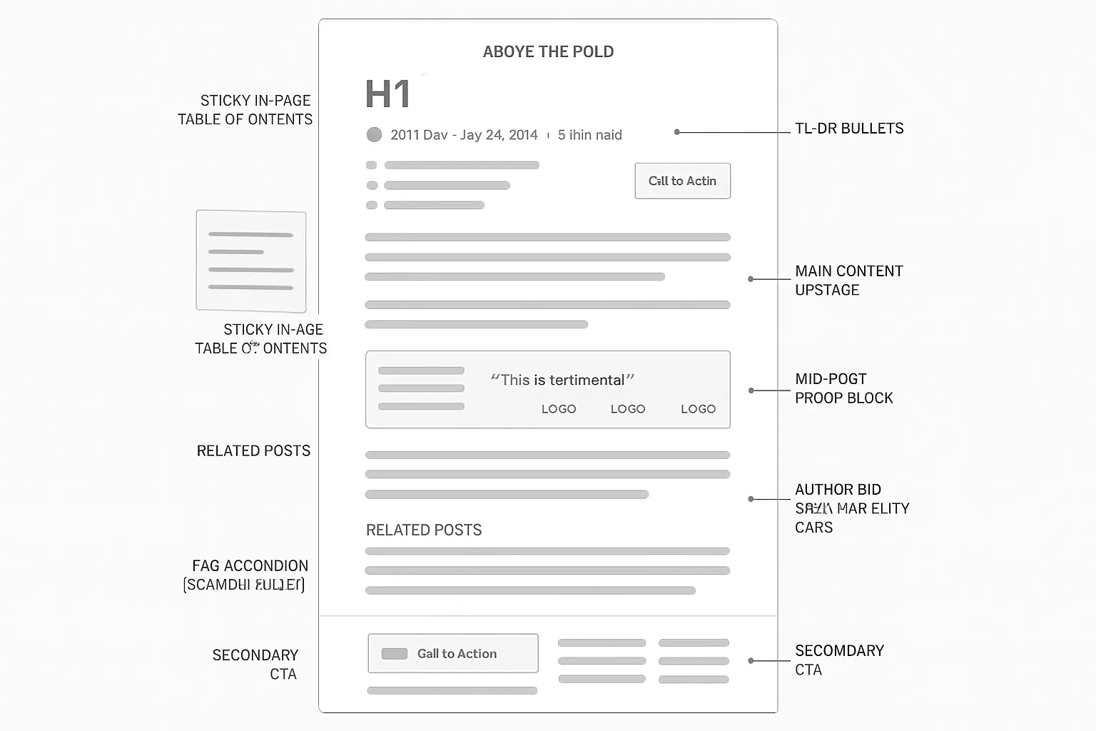
Must‑have structural blocks
In‑page table of contents (sticky on desktop) to orient and speed navigation
Inline content upgrade module (contextual) matched to the paragraph intent
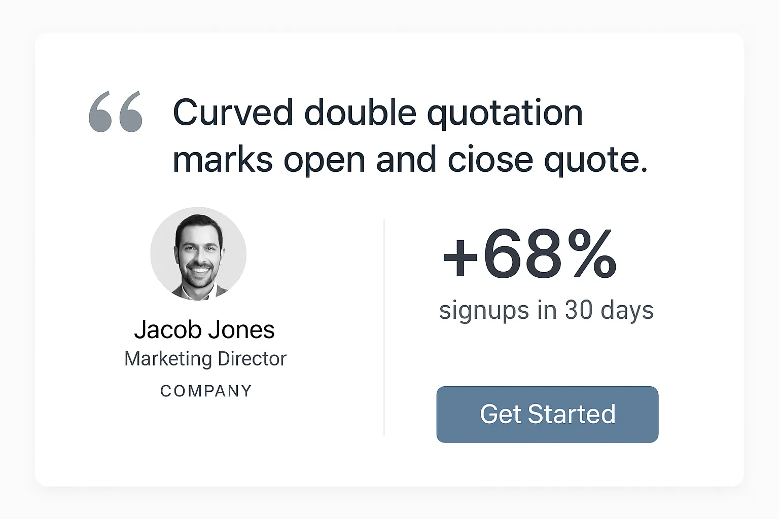
Mid‑post proof block (testimonial, logos, results) to reduce friction at the decision point
Related posts by topic cluster (end of post) to retain engaged readers and boost topical authority
Author bio (with credibility cues) + FAQ (schema‑ready) to increase trust and capture long‑tail questions
Sidebar strategy
Mobile: no sidebar - keep it distraction‑free
Desktop: use a sticky TOC or a single focused CTA (e.g., “Get the checklist”) - not both; avoid competing attention anchors
Footer that converts
Secondary CTA (newsletter) that summarizes the article’s promise
Lightweight social proof (logos, review snippet)
Minimal navigation to key destinations (Home, Categories, Pricing, About)
BlogBowl quick win
Toggle modules on/off per template (TOC, inline upgrade, proof, related posts, author/FAQ)
Auto‑populate related posts via cluster tagging to keep readers in your topic ecosystem
Layout block | Conversion purpose | Best practices | BlogBowl feature |
|---|---|---|---|
Hero (H1 + byline/meta + TL;DR + soft CTA) | Capture attention and drive an early micro‑conversion | Mirror query intent in H1; show updated date/reading time; keep TL;DR to 3–5 bullets; use a benefit‑led soft CTA | Prebuilt hero and TL;DR blocks; newsletter CTA above the fold |
In‑page TOC (sticky desktop) | Reduce bounce and increase scroll depth | Auto‑generate from H2/H3; collapse on mobile; highlight current section | Auto TOC with sticky option and section highlight |
Inline content upgrade | Convert engaged readers mid‑flow | Match to the paragraph topic; use 1–2 benefit bullets and a clear “Get the template” CTA | Inline upgrade block with asset library and gated capture |
Mid‑post proof block | Overcome skepticism at the decision moment | Add quantified results, logos, or a short testimonial; place around 40–60% scroll | Proof/testimonial and logo strip blocks with placement controls |
Related posts (topic cluster) | Keep readers in the funnel; build topical authority | Surface 3–6 posts by cluster; include descriptive micro‑copy | Auto related content via cluster tagging and engagement ranking |
Author bio + FAQ | Build trust and satisfy edge questions | Include credentials, links to socials; 3–5 FAQs with concise answers | Author profile component + schema‑ready FAQ block |
Sidebar (desktop only) | Support navigation or a single focused CTA | Choose TOC or CTA - not both; make it sticky and minimal | Sidebar region with toggles for TOC or CTA |
Footer (newsletter + social proof) | Capture late opt‑ins and exit intent | Summarize value; add small proof; keep nav minimal to avoid leakage | Newsletter block, logo strip, and minimal footer nav presets |
CTA strategy for blog posts: placements, copy, and intent
Choose one primary goal per blog page (avoid competing CTAs)
Every post should push one clear action - newsletter signup, content download, trial, or demo. Secondary CTAs are supportive, not competing. If you need multiple, stage them by funnel depth and placement.
CTA placements that work
Top (soft CTA): newsletter or content upgrade related to the headline’s promise
Mid‑content (contextual): offer tied to the specific section (template, checklist, calculator)
End (strong CTA): trial/demo or in‑depth guide for readers who reached the conclusion
Sticky mobile bar: one concise, persistent CTA for thumbs
Exit‑intent (ethical, value‑first): only if it adds clear value and doesn’t block content
Copy that earns the click
Benefit‑first and specific: “Get the wireframe,” “Start the audit,” “Send me the checklist”
Keep buttons to 2–5 words; use first‑person where appropriate (“Start my trial”)
Avoid friction early: swap “Buy/Register” for “Get/Try/See” until intent is higher
Pair with nearby proof or a one‑line value prop to boost clarity
Personalization without heavy lift
Match CTA offer to category/cluster (e.g., SEO posts show “Keyword Brief Template”)
Returning readers see a next‑step CTA (e.g., from “subscribe” to “try BlogBowl”)
Localize small bits (currency, region) only where it increases clarity
Test small, learn fast
Iterate button color contrast, label, size, and proximity to proof every two weeks
Measure per‑placement CTR (top/mid/end), assisted conversions, and scroll thresholds
Ship changes behind flags to compare cohorts cleanly
"Personalized CTAs convert 202% better than basic ones." - Source
BlogBowl quick win
Use BlogBowl’s dynamic CTA blocks to auto‑match offers to the post’s topic cluster and reader status (new vs. returning), so every post promotes the next best action without manual setup.
Reader intent stage | CTA type | Placement | Button copy examples | Success metric |
|---|---|---|---|---|
Cold (informational intent) | Soft subscribe or content upgrade | Top (under intro/TL;DR) | Get the checklist; Send me updates; Download the template | Top CTA CTR, email opt‑ins |
Warming (engaged in section) | Contextual upgrade or tool | Mid‑content, next to relevant paragraph | Try the calculator; Get the swipe file; See examples | Mid‑placement CTR, tool signups |
Problem‑aware, solution‑curious | Light product tour or feature explainer | Mid‑to‑late section after proof block | Watch the 2‑min tour; See how it works | Video plays, tour CTR |
High intent (finished post) | Trial/demo or deep guide | End of post, above related posts | Start my free trial; Book a 15‑min demo; Get the full guide | End CTA CTR, trials/demos |
Mobile skimmers | Persistent single CTA | Sticky mobile bar | Get the template; Join free | Sticky CTR, opt‑ins by device |
About to exit | Ethical, value‑first offer | Exit‑intent (desktop only) | Grab the checklist; Save this guide | Exit capture rate, bounce delta |
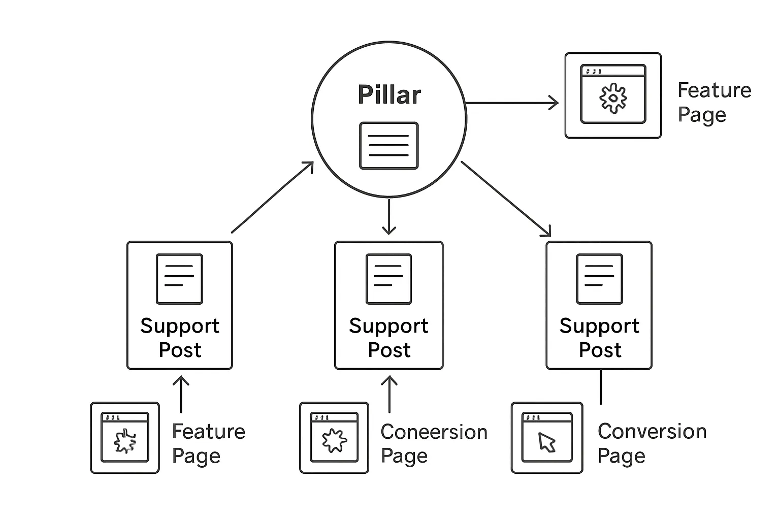
Internal linking and content architecture that drive signups
Build topic clusters that ladder to your product
Create clusters that map learning to doing - and doing to signing up.
Pillar page ↔ support posts ↔ product/feature pages
Each support post should teach a slice of the pillar topic and introduce the relevant product capability.
Product/feature pages close the loop with demos, templates, or trials.
Internal link patterns that lift conversions
Use consistent link choreography so readers always know the next best step.
Early contextual link to the pillar: give skimmers an immediate, comprehensive path.
Mid‑post link to a feature page: place near a proof block or how‑to segment when intent rises.
End‑of‑post next‑best‑read + product tour: keep researchers engaged or move high‑intent readers to action.
Anchor text that persuades
Make links carry the promise.
Action‑oriented: “See the workflow,” “Generate your brief,” “Compare templates”
Specific and benefit‑led: “Automate internal links in minutes,” not “learn more”
Avoid generic “click here” - it wastes prime real estate and hurts accessibility
Modules that do the heavy lifting
Smart “Further reading” box that recommends within the same cluster
In‑line definitions with links to glossary/pillar pages to reduce confusion and pogo‑sticking
Mini case‑studies (3–4 lines with metrics) that link to features used in the win
BlogBowl quick win
Turn on BlogBowl’s automatic internal linking and related‑post logic. It maps anchor text to your clusters, injects contextual links where intent peaks, and surfaces next‑best reads - so every post quietly nudges readers toward signup.
Speed, accessibility, and readability: UX ground rules for every blog page
Performance first (Core Web Vitals)
Targets: LCP < 2.5s, CLS < 0.1, INP < 200ms
Optimize delivery: lazy‑load images, defer non‑critical JS, minify CSS/JS
Preconnect/preload: fonts and critical resources; use font‑display: swap
Compress hero media: modern formats (WebP/AVIF), explicit width/height to stabilize layout
Cache and CDN: HTTP/2 or HTTP/3, brotli compression, edge caching
"Core Web Vitals are a set of metrics that measure real-world user experience for loading performance, interactivity, and visual stability." - Source
Accessible by default
Color contrast ≥ 4.5:1 (WCAG AA body text); ≥ 3:1 for large text
Visible focus states on links and buttons; never remove outlines without a replacement
Full keyboard navigation and skip‑to‑content link
Tap targets ≥ 44×44 CSS px; adequate spacing to prevent mis‑taps
Semantic HTML (headings in order, lists, landmarks) + meaningful alt text
Readability that reduces bounce
Base font size ≥ 16px; body line length 60–85 characters
Line height 1.5–1.8; paragraph spacing to avoid wall‑of‑text
Scannable subheads every 200–300 words; bullets and pull‑quotes to break up content
Front‑load value in the first two screens; avoid decorative hero images that hurt LCP
Use plain language, active voice, and concrete examples
BlogBowl quick win
Use BlogBowl’s fast, SEO‑optimized templates with image optimization and a global CDN baked in. Preconfigured Core Web Vitals settings, lazy loading, and minified assets help you pass performance audits out of the box - so you can focus on content, not config.
Content that sells without selling: structure, proof, and trust
Story arc for blog posts that convert
Use a narrative flow that guides readers from curiosity to clarity to action:
Hook → Problem → Stakes → Insight → Solution framework → Next step
Keep each section tight and skimmable with descriptive subheads and 2–4 sentence paragraphs.
Signal outcomes early; deliver the “how” with just enough detail to build confidence, not overwhelm.
Embed proof where attention peaks
Use data points, mini case studies, and short quotes right before or beside CTAs.
Quantify outcomes (percent lifts, time saved, cost reduced) and name roles/industries for relevance.
Place one proof block mid‑article and one near the final CTA to reinforce momentum.
Remove doubts with trust cues
Author expertise: show credentials, years in role, and relevant accomplishments.
Editorial standards: disclose sources, update cadence (“Reviewed quarterly”), and conflict‑of‑interest notes.
Privacy near forms: clearly state data use, spam‑free policy, and one‑click unsubscribe.
When relevant: money‑back or satisfaction guarantee for templates or paid resources.
BlogBowl quick win
Drop in BlogBowl’s one‑click testimonial/proof blocks and place them at key decision points.
Use AI‑generated summaries to auto‑populate your TL;DR module with accurate, benefit‑led bullets.
Measure what matters: analytics and experimentation for blog conversion
Conversion analytics to set up on Day 0
Instrument once, iterate forever. Track the small wins (micro conversions) that ladder to signups.
Primary CTA clicks
Capture per placement: top, mid, end, sticky, exit-intent
Event params: placement, device, variant ID, topic cluster
Content upgrade opt‑ins
Event + form submit (success state), asset ID, post ID
Scroll 25/50/75/100%
Use events for each threshold; correlate with CTA visibility
Read‑time thresholds
10s/30s/60s+ engaged time (exclude inactive time)
Internal link CTR
Track clicks to features/pricing/templates; include anchor text and position
Assisted conversions
Attribute blog pages in multi‑step journeys (e.g., first touch blog → trial)
Segmentation
Break down by device, source/medium, topic cluster, and new vs. returning visitors
Pro tip: build a “Blog Post Funnel” (view → 50% scroll → primary CTA click → signup) to spot the biggest drop‑offs fast.
Diagnose with behavior tools
Numbers tell you what; behavior shows you why.
Heatmaps
Click, move, and scroll maps by device; validate CTA prominence and fold placement
Session replays
Watch high‑intent sessions that didn’t convert; note hesitation points and dead ends
Rage/tap metrics
Identify mis‑taps on mobile, overlapping elements, or sticky bars covering CTAs
TOC clicks
Measure usage of the in‑page table of contents; prune unused sections, rename vague headers
Turn insights into iterative tests
Make learning a habit, not a project.
Cadence: Hypothesis → smallest change → ship → learn → keep/kill (repeat every 14 days)
Start with low‑lift, high‑signal changes:
Button label clarity (benefit-first, 2–5 words)
Placement (move mid‑content CTA closer to proof block)
Contrast/size (WCAG‑compliant, thumb‑friendly)
Offer match (swap generic subscribe for topic‑specific upgrade)
Proximity to proof (testimonial or result adjacent to CTA)
Guardrails
Hold Core Web Vitals steady (no heavy hero images, no blocking scripts)
Run per‑device if traffic skews mobile
Track success per placement and overall funnel, not just click spikes
Decide with data
Success metrics: CTR uplift, opt‑in rate, assisted conversions, read‑time at 50%+ scroll
If inconclusive: iterate copy or offer, not just color
BlogBowl quick win
Turn on BlogBowl’s privacy‑friendly analytics to see post‑level dashboards for:
CTA CTR by placement and device
Scroll and read‑time distributions
Content upgrade performance by asset
Assisted conversions from each post
With dynamic CTAs and built‑in testing, BlogBowl lets you ship small changes weekly and compound wins across your entire blog.
Ready-to-use blog page templates and a launch checklist
Template 1: Product‑led tutorial blog page layout
Goal: trial/demo
Placements:
Top soft CTA: “Get the template” or “Start my 7‑day trial”
Mid tutorial upgrade: inline checklist or downloadable assets tied to the walkthrough
End demo CTA: “See it in action - 2‑min tour” or “Book a quick demo”
Template 2: Thought‑leadership blog layout
Goal: newsletter growth
Placements:
Above‑fold subscribe: promise a specific cadence and value
Mid proof: quote, data point, or logo strip that validates authority
End next‑article: link to a follow‑up piece in the same cluster to deepen engagement
Template 3: SEO long‑form comparison/roundup
Goal: BOFU conversions
Placements:
Sticky comparison table link: “Jump to comparison” pinned on desktop
Mid proof: short case snippet showing results with your solution
End “Start free trial”: benefit‑led copy plus a tiny reassurance (no credit card, cancel anytime)

Pre‑publish checklist (15 items)
SEO
Keyword/intent match in H1, intro, and subheads
Schema (Article/FAQ) validated
2–4 internal links to pillar/feature pages
Descriptive, unique title tag + meta description
Descriptive, keyword‑rich image alt text
UX
TL;DR added and visible above the fold
LCP < 2.5s; images compressed; lazy‑load non‑critical media
Accessible color contrast (≥ 4.5:1) and visible focus states
Mobile spacing/padding; tap targets ≥ 44×44 CSS px
Readability: font size ≥ 16px; 60–85 character lines; subheads every 200–300 words
Conversion
Primary CTA set (one goal per post)
Contextual mid‑post upgrade aligned to content
Proof block added near a CTA
Related posts by topic cluster enabled
Analytics events: CTA clicks, scroll depth, read‑time, internal link CTR
BlogBowl quick win
Start from BlogBowl’s conversion‑ready templates, then save your variations as reusable presets across unlimited blogs. Auto‑enable TL;DR, newsletter, proof, related‑posts, and comparison components so every new post launches conversion‑ready by default.
Conclusion: Launch a blog page that converts with BlogBowl
Recap: Layout, CTAs, proof, speed, and measurement work together
A high‑converting blog page layout isn’t a single tactic - it’s a system. When your blog page layout matches search intent, your CTAs are staged to the reader’s journey, your proof is embedded where attention peaks, your pages are fast and accessible, and your analytics fuel quick iteration, conversion rises across the board. Each factor multiplies the others.
Your next step
Spin up a conversion‑ready blog in under 60 seconds with BlogBowl
Let AI handle daily SEO‑optimized posts, internal linking, and embedded media while you focus on strategy
Use fast, SEO‑optimized templates, built‑in newsletter, and privacy‑friendly analytics to turn micro conversions into trials and demos - without code
Scale across unlimited blogs with cluster‑aware related posts and dynamic CTAs that adapt to reader intent
Call to action
Start your free trial on BlogBowl.io and turn every post into a revenue‑ready page.